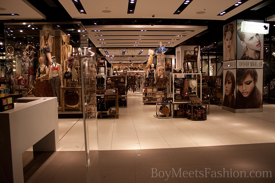
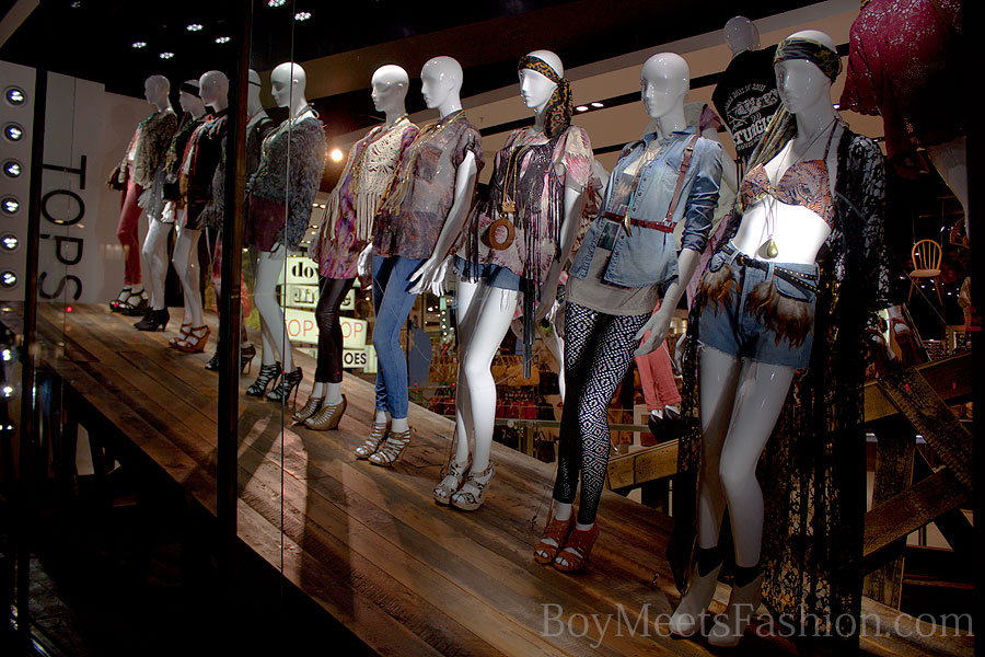
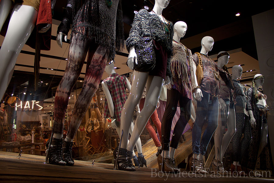
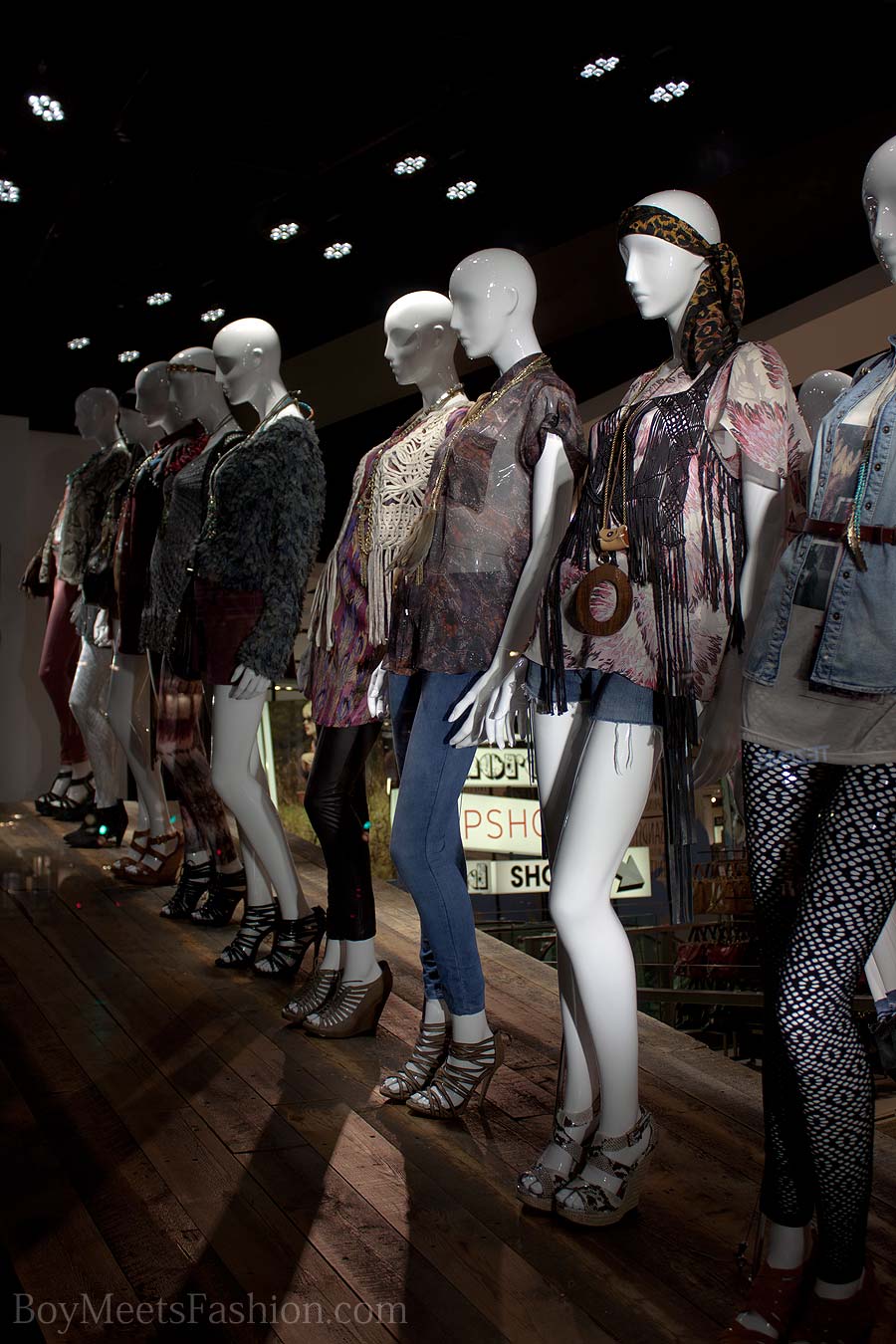
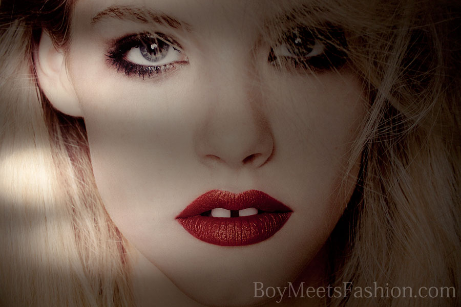
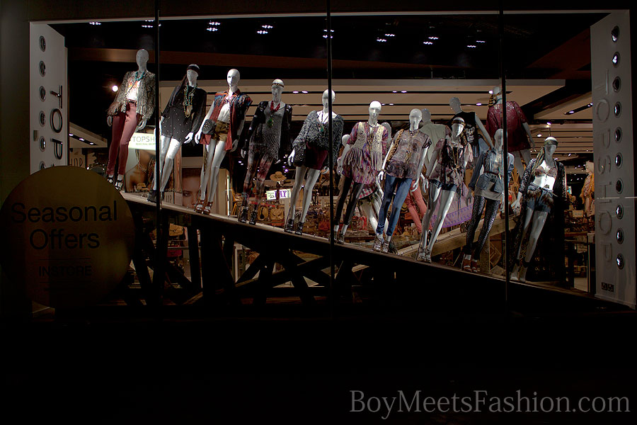
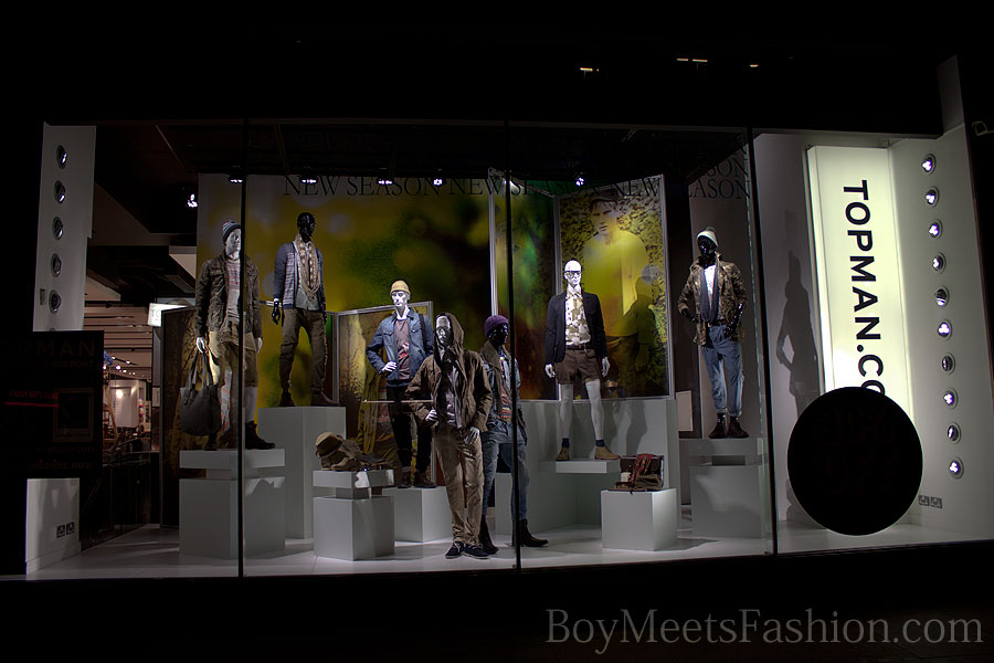
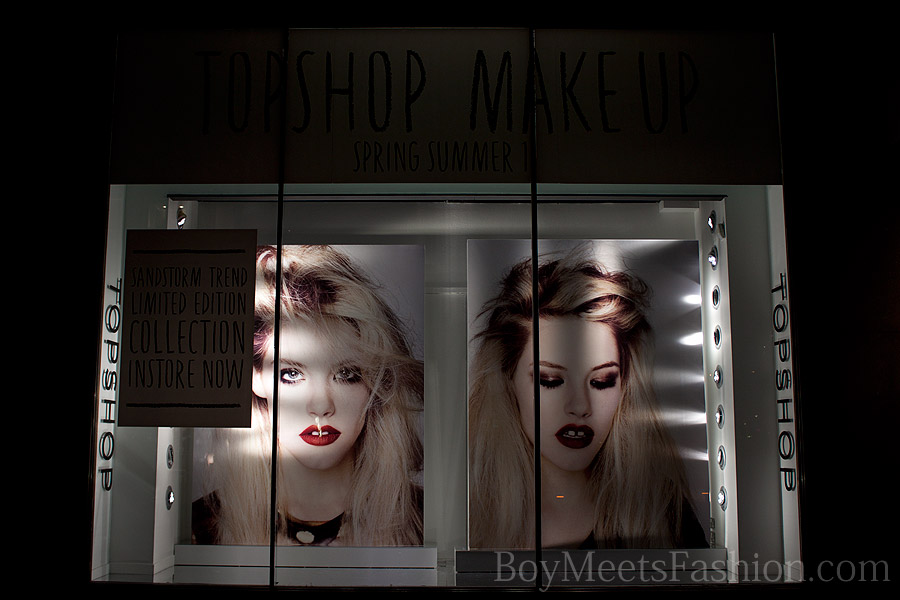
I like how they way have placed the mannequins on platform tilting at angle and yet managed to keep them all standing upright on the main window. It’s a clever way of making people stop and take a look at them as they pass through the store. There is a wide range of fashion items on view for the legs – shorts, tights, jeans and leggings. As for shoes there are full boots, ankle boots, sandals & wedges. Another window features a giant poster of a model, promoting make-up for the spring/summer season. The men’s window is sadly boring in comparison and I just do not understand why they do not put more effort into making the men’s range look more interesting. Come on Topshop, you can do so much better. The store is full of great t-shirts, jackets and coats so what is the reason for the dull looking outfits?
The men’s disappointing window:
Make-up promotion:
Inside the store:
